I’ve already had a few people ask how we made the award, and the answer keeps getting longer. The thing you can hold is one part of it. There were models and print tests, artwork, a photo shoot, video, an assembly film, a website, and, somehow, a penguin.
I worked on it with Codex throughout. We used it to write modeling scripts, inspect parts, process footage, build the site, and work through some desktop apps. I made the design calls, printed and tested the parts, shot the photos and video, and kept coming back with what needed to change. A model could look good on screen, and the printed part could still need another round of changes.
This is how it came together, including the things we tried that didn’t make the final version.
It started with a lot more keys
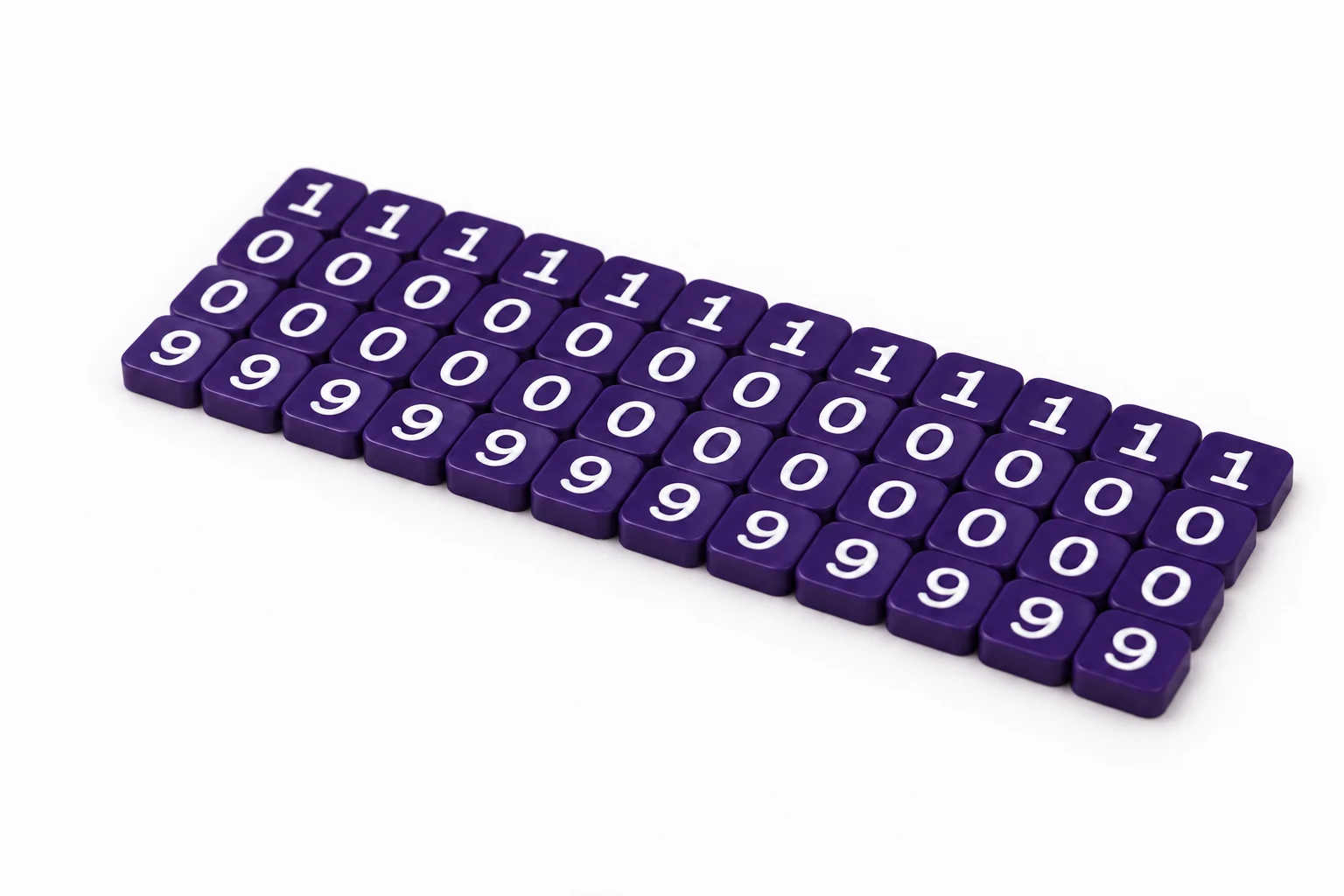
The first model was a pretty basic test back in August. We generated a file, brought it into Shapr3D, and checked whether the workflow even made sense. Once it did, I started thinking about an award shaped like a keyboard, with individual keycaps spelling out the hackathon wording.
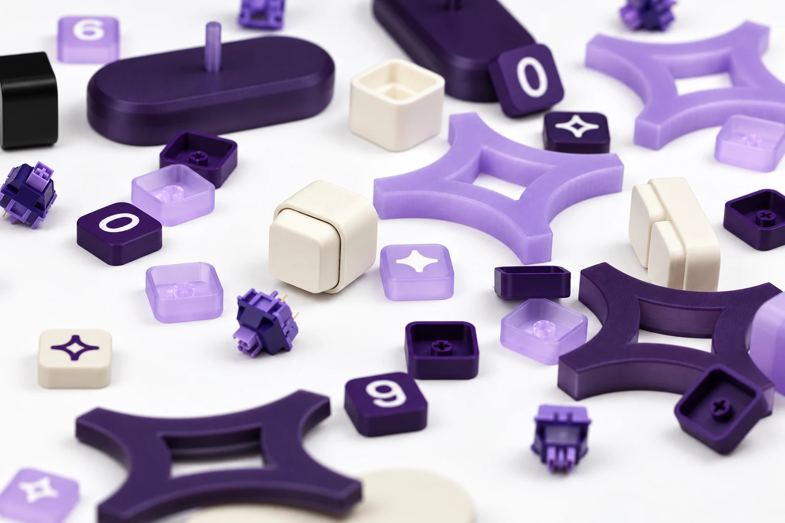
We started from an existing four-by-four keyboard model and tried layouts with nine columns and three rows, then two rows. Resizing the whole model looked tempting. But a switch opening has to remain the size of an actual switch. Stretch the model and you also stretch the holes, ledges, walls, and spacing that make the whole thing fit together.
So we rebuilt the layout around the measurements that couldn’t move. I wanted rounder corners, more even gaps, a deeper switch plate, and better support underneath. We also removed openings meant for electronics. This was going to be a decorative award you could click, not a working keyboard.
Then I started doing the math on making them. The largest team could have twelve people. Twenty-seven decorated keycaps for each person’s award would have meant hundreds of small pieces to print and assemble. That made the larger keyboard design hard to produce for a whole team.
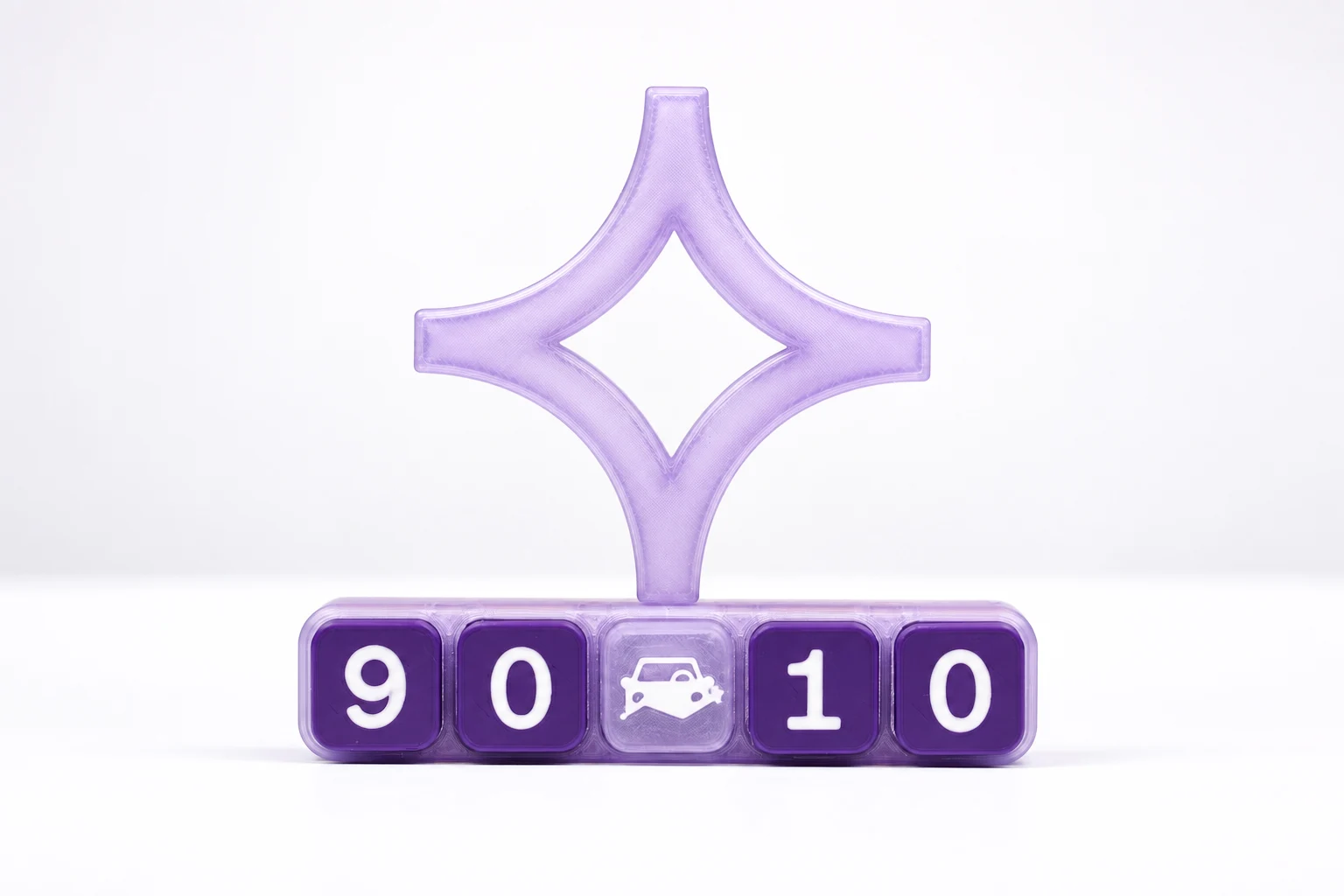
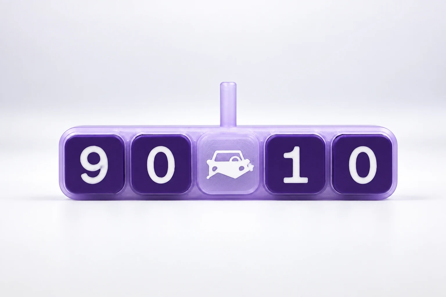
We tried smaller clickers and enclosures before landing on a five-key version built around the hackathon’s 90/10 theme, with an AI star above the switches. The 90/10 idea was about working toward more automation for repetitive work while keeping people involved in the decisions that need them. It was the theme of the event, not a claim that we’d reached some measured ratio. Fleetio supplied the visual identity, which gave us a starting point for the award and eventually the site.
What I used to make the parts
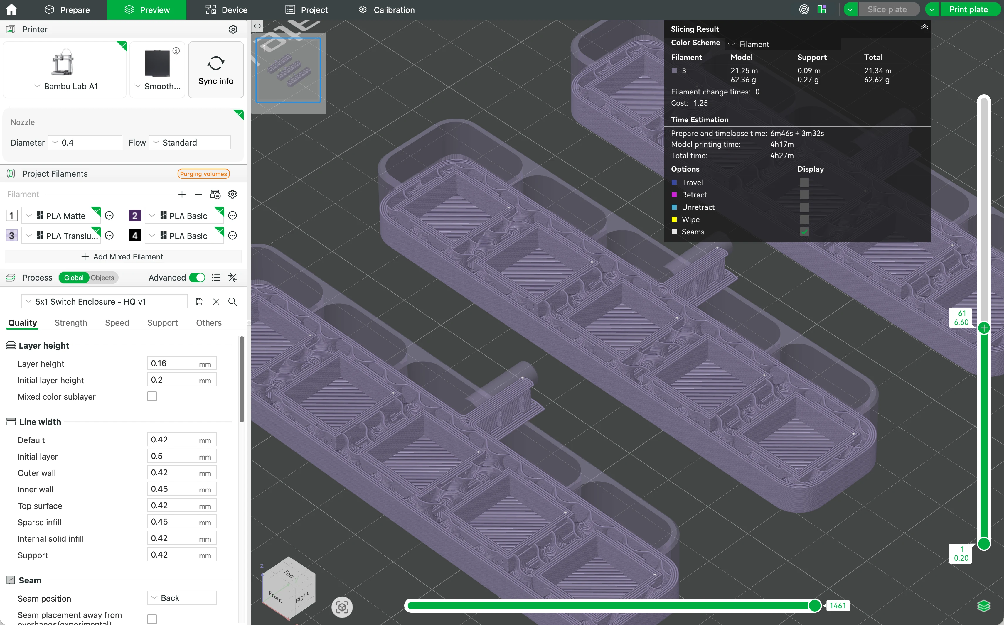
The printer was my Bambu Lab A1, with an AMS Lite and a 0.4 mm hardened-steel nozzle. I printed in PLA and switched between textured and smooth build plates depending on the surface I wanted. The main colors were translucent lavender, purple, and white.
The translucent filament changed how I looked at the models. You can see some of the structure inside a printed part, so the internal pattern affects the outside appearance. A model can be the right shape and still look different once it’s sliced and printed in that material.
For the modeling, we used Shapr3D, Bambu Studio, and Python scripts that generate geometry from dimensions. Some of the solid modeling used build123d. Other scripts checked meshes and exports. Shapr3D was useful for inspecting and working with CAD parts; Bambu Studio showed us what the printer would actually do with them.
We tried drawing directly in the CAD app through computer control early on, but it wasn’t reliable enough for repeated revisions. Generating the part from a script and importing it worked better. If a support was too high or a hole needed to change, we could edit that one dimension, export a new revision, and still know how we got there.
We also made browser previews of the parts. I could rotate a model, look underneath, pull pieces apart, and see how they seated together. That caught some issues before a print and made it much easier for me to point at the exact thing I wanted changed.
The tools we made for ourselves
We started with a supplied 3D-modeling skill for Shapr3D and Bambu Studio, then adapted it to my actual setup: the A1, AMS Lite, nozzle, build plates, and PLA I had on hand. In Codex, a skill is a set of instructions and references it can reuse for a particular kind of work. Ours covered measurements, editable sources, exports, geometry checks, and print preparation. We added an expectation that new models should have an interactive preview, because I kept needing to see how parts fitted together before printing them.
Then we built project-specific tools. There were generators for the star and keycaps, little fit-test pieces that saved a full print, model viewers, export checks, and scripts that kept the Illustrator artwork lined up with the printed parts.
Codex could also use the computer and browser with me. It inspected what was happening in Bambu Studio or a local model viewer, worked through some app interfaces, and tested the site in a browser. For repeatable changes, a script was usually easier to trust than a long sequence of clicks.
Most revisions started with me describing a problem and sending a photo, screenshot, or measurement. Codex would inspect the files and make a new version. We’d look at it from a few angles, then I’d print a sample and try it with the real switches or other parts. That’s when I could tell whether a fit was good or whether something that looked fine on screen still needed work.
The small measurements that kept changing
I don’t have a neat number for how many times we tried things. The star files reached R10, the separate stand R9, and the keycaps R10. An early keyboard enclosure script reached R11. The five-key clicker bar had three named revisions, including one with a snap-in center cap. Those names mark versions of different parts. They don’t mean we printed ten complete awards.
The star and its peg are a good example of why we kept making versions. We first tried a slotted stand, then moved to a peg so the star could spin. The hole in the star needed enough room to move, but not so much that the star wobbled. We printed small test pieces to compare sizes without using the time and filament for a full award every time.
Even with the same modeled dimensions, print orientation changed the result. A peg printed sideways with supports had a different surface from one printed vertically, and that changed how the star moved on it. Later, with the full height and weight of the star, a 5.6 mm hole felt loose. A 5.5 mm hole was too tight. We made the next model 5.56 mm. I wouldn’t treat that file number alone as proof of a final physical fit; it still needed a print and a test.
The keycaps had a similar issue. Some gripped the switch stems so tightly that removing them felt risky. We changed the width and span of the cross-shaped opening separately, along with the outside of the socket. The final exported geometry had a 1.40 mm arm width, a 4.30 mm tip-to-tip span, and a 5.6 mm outer boss.
We also found a support under the switch plate that touched just before the surrounding ledge did. That tiny height difference made the plate rock. It wasn’t something another render would solve. We had to change the support and check the physical part again.
Making the lettering part of the print
I drew the keycap artwork in Illustrator and supplied SVGs for the numbers, stars, and Fleetio mark. We turned those shapes into separate printable inlays, matched to the colored keycap geometry, so the white lettering sat in the surface instead of being applied afterward.
That choice came partly from the number of awards we needed to make. Decorating hundreds of little caps by hand wasn’t going to be much fun, and it would be hard to keep them consistent. Printing the artwork as part of each cap made more sense, but it introduced its own small problems. We had to preserve the placement of the original art, adjust details that didn’t survive the print, and look closely at the first layer in Bambu Studio. When tiny pieces of a white star went missing, we looked at the slicer’s paths as well as the model. The depth of the inlay wasn’t necessarily the cause.
We learned a lot about where a corner becomes too fine for a 0.4 mm nozzle, how first-layer edges behave, and where supports leave marks. Some of the starting geometry came from existing models, including the keyboard layout and a clicker base. We changed those for this award and made the star, mounting details, keycaps, inlays, and revision tools around them. The switches themselves were purchased parts.
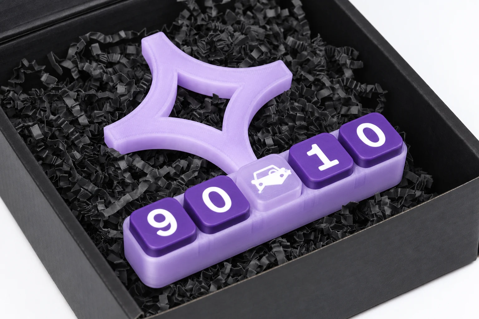
There was another whole set of decisions once the object was ready: printed artwork, Cricut cutting, and the black packaging. We photographed the award open, closed, and packed because I wanted people to see what someone would actually receive, not only a clean model on a screen.
Shooting the award
I shot the product photos on my Canon EOS R6 Mark II with a 70 to 200 mm f/2.8 lens. We used controlled lighting and a custom white balance, and talked through using a gray card to keep the color consistent. I wanted the material and little details to come through, with the kind of care you’d expect in a product launch shoot.
We also tried to set up Lightroom Classic tethering so I could review photos on the computer while shooting. We ran into connection issues along the way.
Afterward, we organized the photos and tried AI-assisted edits for some of the product images. The requests were specific: clean up a background, adjust the light or tone, and present the award and packaging more clearly. We saved the resulting images with the prompts so I could trace what had been asked for.
Those edits used JPEG previews extracted from the Canon CR3 files. They weren’t Lightroom developments of the RAW files, and the originals stayed separate. Once I’d chosen images for the site, we resized and encoded web versions so people wouldn’t have to download full-size photo files just to read the page.
The footage and the color
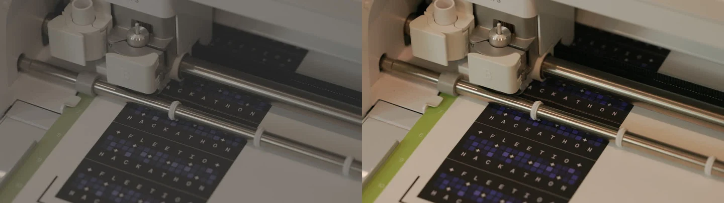
I filmed pieces of the making process, too: enclosures on the printer, keycap details, stars being printed, and the Cricut cutting artwork. I wanted the site to show some of the work happening, not only the finished object.
We used FFprobe to inspect the recordings, FFmpeg to cut and process them, and Python scripts to keep the review and exports organized. It mattered that we checked the actual files. The earlier footage was already in standard Rec.709 color, while the later recordings used Canon Log 3 and Cinema Gamut, which I confirmed from the camera settings. Treating all of those clips the same way would have made them look wrong.
For the Log footage, we first used Canon’s conversion to bring it into a normal viewing color space. Then we worked on the look: how warm the light felt, what was visible in the dark parts of the printer, and whether the purples still looked like the parts I’d shot. We compared before-and-after frames and watched playable exports instead of judging the grade from one still.
There was an early ten-second montage. For the more complete pass, we went through 17 original recordings and kept 17 selects from 16 usable takes. One recording gave us two useful views; another had too much camera movement and time out of focus. We trimmed away the starts, reframing, and focus hunting to get to the moments worth showing.
We kept 4K ProRes editing masters, made 1080p and 720p copies for the web, and saved poster images. The cuts and color settings were recorded so we could make the exports again. I picked eight clips for the site. Their short previews load in the page, and the longer versions open when someone asks to see them. That let us show movement without making everyone download eight full videos on arrival.
Building the assembly film in Blender
The animation where the award assembles itself wasn’t shot on camera. I wanted the enclosure to come in, the switches to hop into place, the caps to settle on them, and the star to land on its peg. We already had geometry from the physical parts, so we brought that into Blender and scripted the animation in Python. Cycles rendered the lighting and materials.
The purchased switch needed more work than I expected. We reconstructed it from reference photos and went through six versions. I’d compare each one to a real switch and point out what felt off: a housing too short, a stem too tall, a clip where the real part didn’t have one. It’s a small thing in the frame, but if you know the award, you notice it.
We made four early motion proofs, then a fourteen-second film, then versions of a twenty-second loop. We tried a deliberately stepped, almost stop-motion feel before moving to smoother motion. In the later sequence, the enclosure scoots into view, the switches march and hop in, the keycaps settle, and the star spins as the camera rises.
The frame goes to white at the end and starts from white again, so it can loop on the site. We saved the editable Blender scenes, scripts, frames, and exports. If I wanted to change a movement or a material, we still had the parts that made the film rather than only a final video file.
Where Pip came from
Pip started with something I kept seeing around Fleetio engineering: penguins in Slack, profile pictures, and emoji. I thought a small penguin on the site could be a fun nod to that. The early visual references included Lil Finder Guy and the soft character style I liked in Meta’s Muse work. We used image generation to explore the character, and I liked the original illustration enough to keep working with it.
I also wanted to see if he could move. We tried three 3D approaches, including a detailed furry Blender version and a lighter one for the browser. We made short transparent animations for things like waving and stretching, plus a blink test. I kept comparing them to the original image, and the original still had the expression and fur I liked most. The animation was interesting, but it wasn’t improving the character.
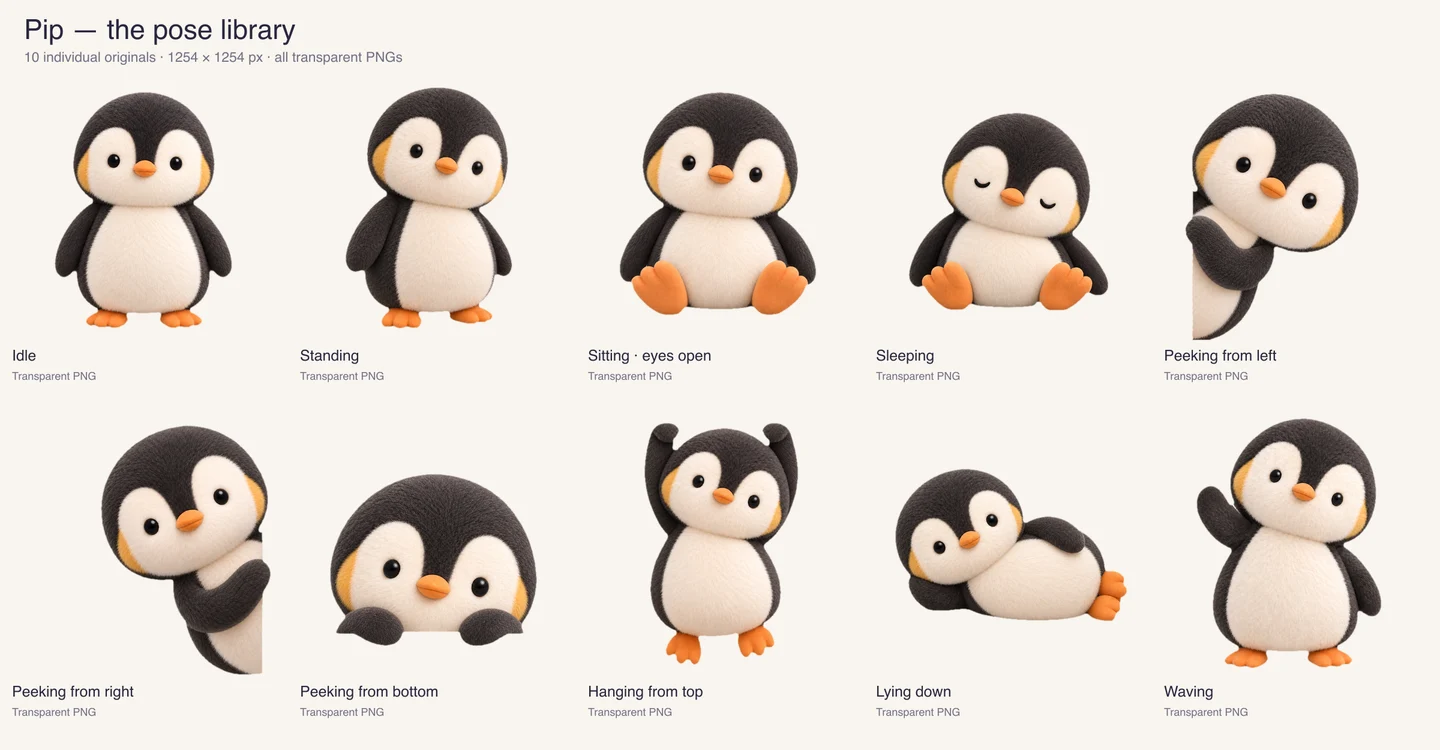
So we made a set of ten high-resolution illustrated poses instead. Pip could stand, sit, sleep, wave, peek around the edge of the page, or hang down from the top. Cleaning up the backgrounds took care. We checked the actual alpha around his soft fur, because an image can look transparent on a checkerboard and still have that checkerboard painted into the file.
Those images became little interactions on the site. He peeks in, rests near the footer, and responds when someone finds him. We adjusted the timing and speech bubbles for desktop and phone. He also got a Fleetio Hackathon shirt, a typing pose with a branded laptop, and a twelve-image set made for Slack emoji.
The footer version can be dragged on desktop, which meant we had to distinguish a drag from a click that opens his message. The final site uses the illustrated Pip with code around him. We kept the 3D and motion experiments, even though that wasn’t the version I wanted people to meet.
The website started with an address
The website started with a practical question: what link do you put on an NFC tag that’s going to live inside a physical award? I wanted the address to keep working while the site changed, so we chose awards.koyworks.com/fleetio-hackathon-2026 as its permanent destination. It could be a simple coming-soon page at first, then grow into the full site later.
The design grew out of the supplied 90/10 artwork, the photos, the film, and the geometry we’d already made for the award. We built it with Astro, TypeScript, custom CSS, GSAP, and Three.js, and hosted it on Cloudflare Workers. Astro builds the pages. Three.js runs the interactive award. GSAP helps with selected motion, and a separate canvas draws the background grid. We talked about other libraries, including React Three Fiber, but used Three.js directly for the final model.
One idea I liked was letting the sixteen stars in the 90/10 mark reveal photos and video. The marks were already there in the artwork; they felt like a more natural place to discover the project than another row of buttons. Getting that interaction right took more passes than the idea itself. We adjusted how the grid responds to the pointer, how bright a star gets, where a preview appears, and what a person on a phone can tap when there is no hover.
The gallery went through a similar change. We tried two moving rows, then settled on one filmstrip that people can browse themselves. Later work was about the feel of the drag and making sure letting go didn’t also open a photo by accident.
The 3D award uses geometry based on the actual parts. You can press the keys and spin the star in the browser. We load that model when someone chooses to explore it, so it doesn’t weigh down the first visit. A phone can also hand off a separate model export to a native AR viewer for placement in a space. That viewer doesn’t bring along the browser’s key and star interactions.
Getting the site out into the world
The code lives in GitHub, and Cloudflare builds the site from the repository. Wrangler handles the Worker deployment. We began with a production build from the main branch, then added pull requests and Worker Previews so I could open a real hosted version of a change before it went live.
That preview step has been useful for this site. Something can look right in a local browser and still behave differently once it’s hosted, especially when the page is loading videos, photos, and the 3D model. We used Playwright to check mobile layouts, keyboard interaction, reduced motion, media loading, and failures. I also kept looking at the page myself and calling out things that felt off.
Some of the work was small but mattered in use. A video should pause after you scroll past it. The model should let you keep scrolling the page. Dragging the filmstrip shouldn’t open an image. Pip shouldn’t block the award. We kept coming back to those details until the site felt comfortable to move around in.
Where AI fit into the work
Codex was there for most of the project. It researched approaches, inspected files, wrote model generators, made interactive previews, helped with desktop apps, processed media, built the site, and tested changes. We used GPT-5.6 models in earlier work and GPT-6 Astra later on. Image generation was a separate part of the process for Pip and the photo edits.
My job was to decide what we were making and what felt right, supply the artwork and references, print the parts, test how they fit, shoot the photos and footage, and keep giving specific feedback. Sometimes that meant saying the star wobbled or a cap was too tight. Other times it was noticing that a Blender switch looked squashed or that Pip’s head tilted when he was supposed to be sitting still.
What made Codex useful to me was being able to keep that conversation going across different kinds of work. I could point to a physical fit problem, look at a new model in the browser, print it, then come back with a photo of what happened. We did the same thing with a video frame or a website interaction. It still took judgment and real tests, but I didn’t have to start over each time the work moved to a different tool.
The finished award leads to the site when you tap it. The page gives me a place to show the parts and experiments you can’t see once the award is assembled.